Determined to Move Dorward and Conquer Greater Achievements | Hylands Revamps New LOGO


LOGO
Time flies. In 2022, Hylands Law Firm celebrates its silver jubilee. Over the past twenty-five years, the Hylands people always held their desire to progress, they faced challenges bravely, adapted to changing times, and march forward keeping their heads high. Hylands always showed the courage to accept changes, the spirit of constant exploration, the desire to seek breakthroughs, and keen at promoting self-growth. On the occasion of the 25th anniversary of its foundation, Hylands Law Firm has comprehensively overhauled its brand image.
Work diligently. Constantly upgrade and innovate.
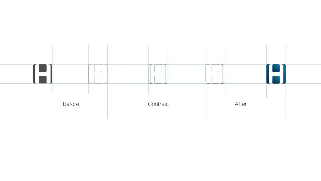
The new logo of Hylands Law Firm continues the use of the core element of the original logo - the letter ‘H’, which is taken from the initial letter of ‘HYLANDS’, but optimizes the proportion of the combination, highlighting the core concept of ‘inheritance and innovation’, and echoing the spirit of ‘sharing and altruism’.
The logo is composed of a square and a circle to achieve a balance of dynamic and static visual effects. Over the past 25 years, Hylands has always adhered to the resolution of ‘creating a professional legal service platform with influence, unique characteristics, a robust system, and inheritance’. Hylands always give prominence to innovation, performing professional division of labor, and implementing integrated management. The circle in the logo represents the sky, and the square represents the earth. The combination of the two figures means that the future of Hylands is as broad as the sky and as solid as the earth.
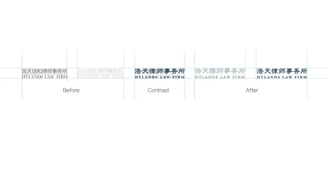
In addition, the Chinese and English names of the law firm have also been optimized. The Chinese name ‘浩天律师事务所’ is beautified with classic official script fonts to reflect the brand's cultural heritage; the English ‘HYLANDS LAW FIRM’ uses simple Baskerville fonts. After the design upgrade, the names can better reflect the rigorous and prudent service attitude of Hylands.

Promising future. Down to earth
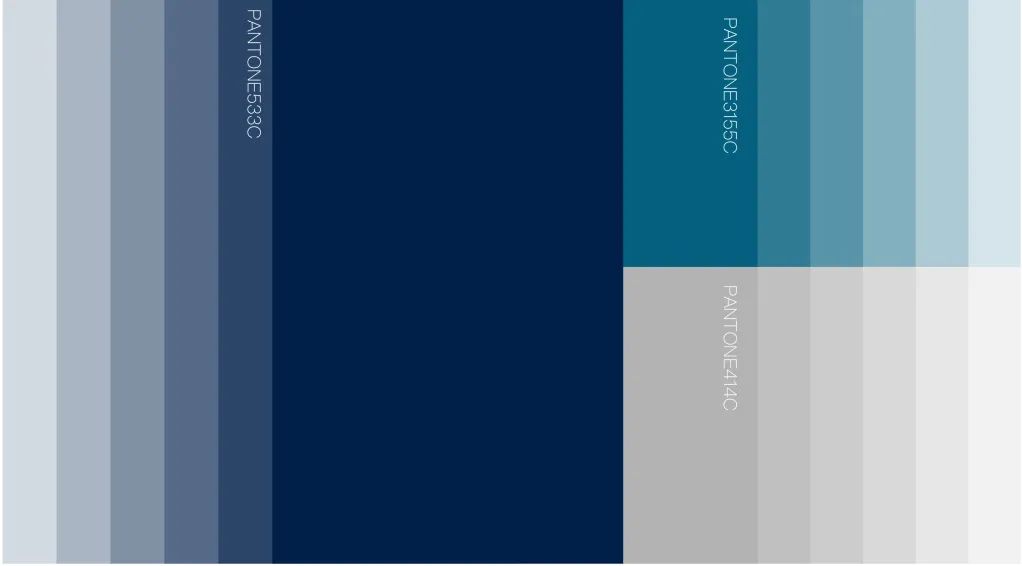
Color is the first identification of a brand. The upgraded logo uses ‘Hylands blue’ as the main color, embellished with sky blue and starry sky blue. Blue embodies calmness and rationality - the attributes of the legal industry. This echoes Hylands' attitude to shoulder responsibilities and gives people a sense of trustworthiness. The gradual color change of Hylands blue reflects the high-spirited and progressive attitude of the firm, implying that Hylands will continue to excel like a star.

Ambitious. A bright future can be expected
Today, Hylands, as a leading large-scale comprehensive high-end law firm, can provide legal services to the whole country, and has the ability to provide customers with one-stop, multi-field, and full-process professional legal services. With the release of the Hylands 2.0 version logo, which gives a better perception of the law firm, Hylands’ brand image will be further projected, laying a foundation for the development of the firm.
In the new era, Hylands will continue to move steadily, stick to innovation, keep advancing, and make new achievements.


