News
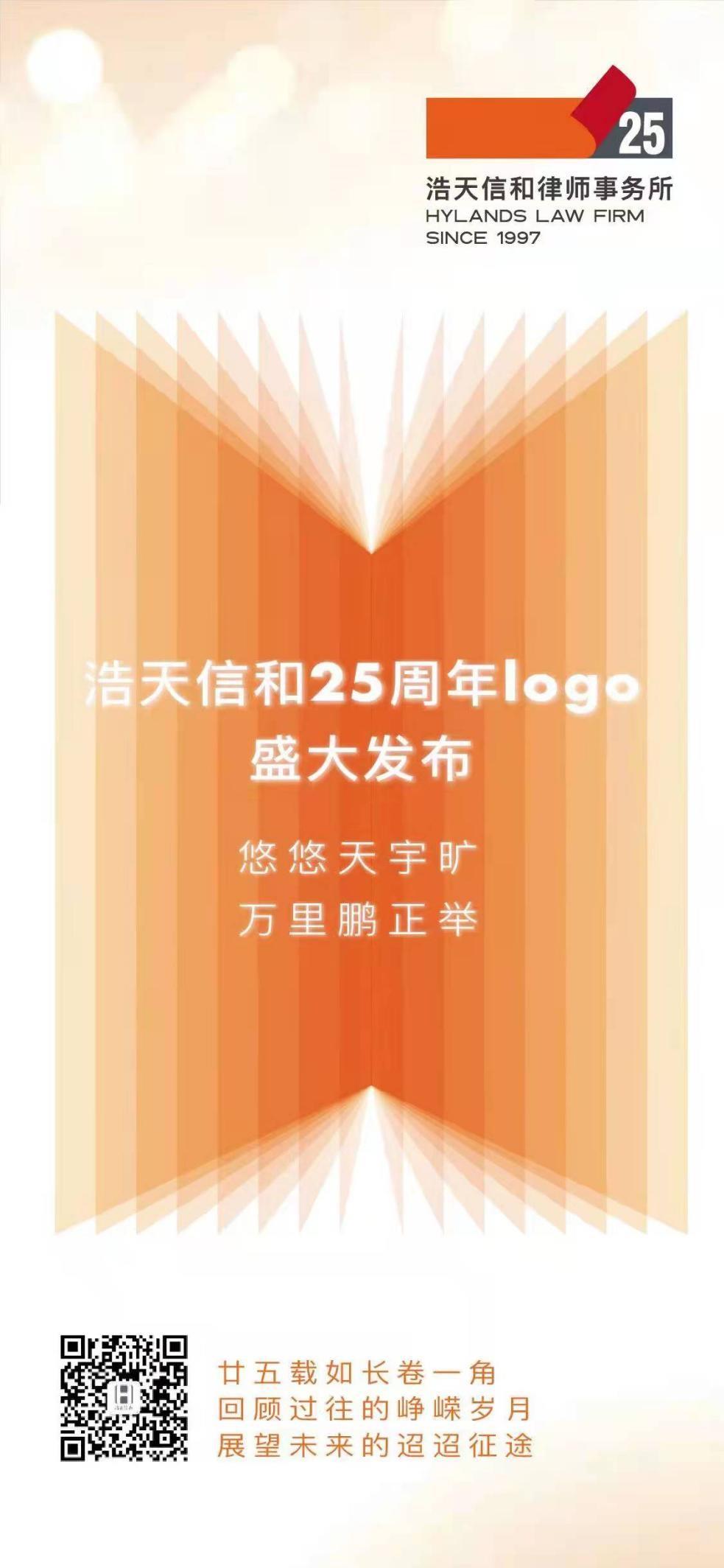
Hylands Releases the 25th-Anniversary Logo


1997
Hylands Law Firm was established
After 25 years of ups and downs
With passion and ambition, we have made extraordinary achievements.
2022
Hylands celebrates its 25th anniversary
After 25 years of ups and downs
We never forget our original aspirations, be perseverant, and try to excel
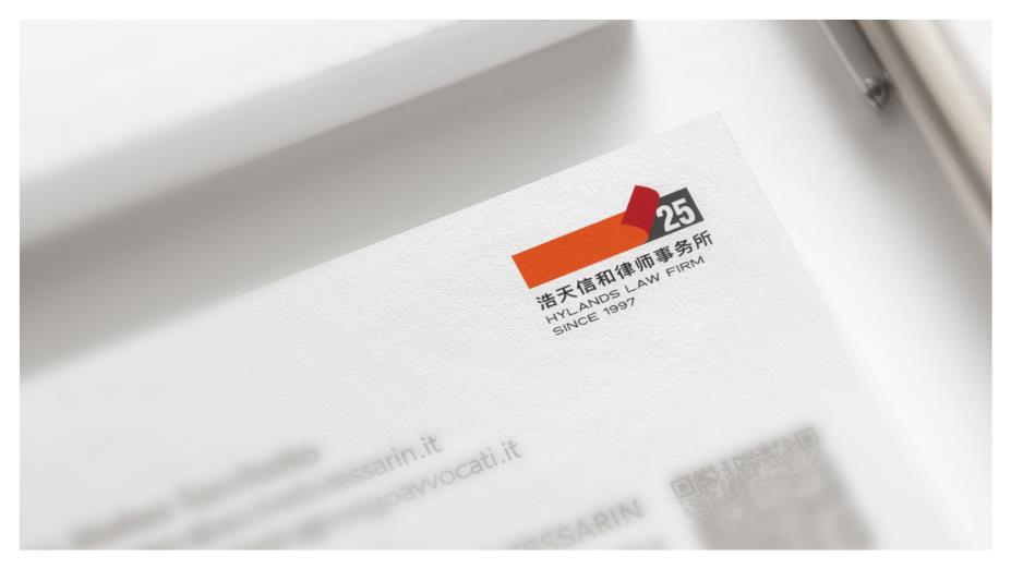
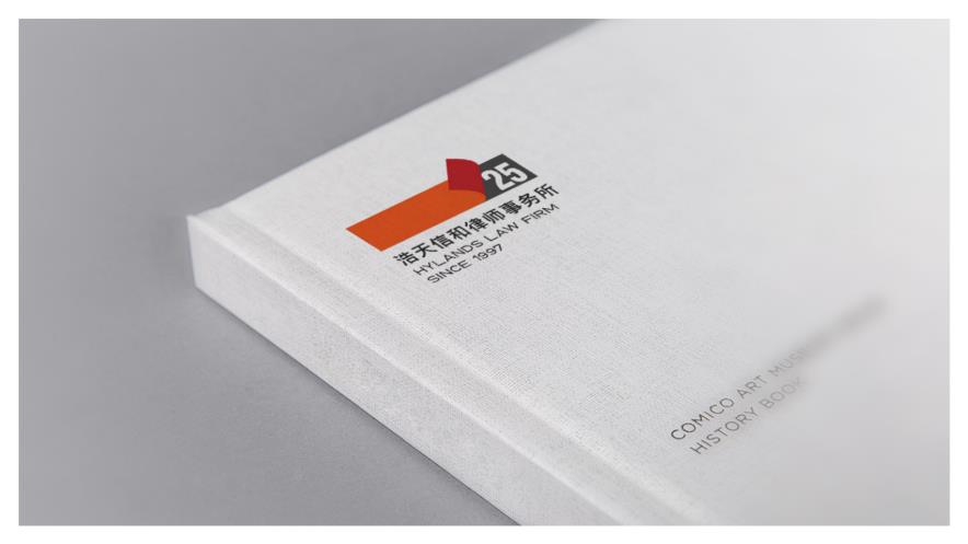
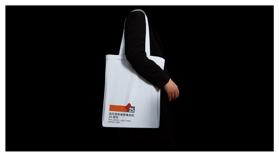
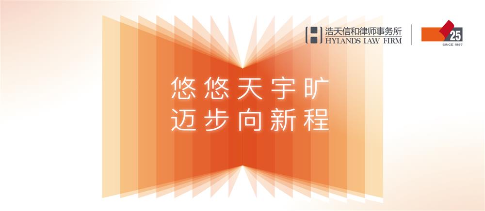
Times pass quickly. On the occasion of the 25th anniversary of its establishment, Hylands Law Firm released its 25th-anniversary logo. This is an upgrade to the original logo, which denotes that Hylands will embark on a new journey with a new attitude.
Embarking on a new journey
The logo takes the shape of a book and marks the 25-year history of the firm as pages of the book. It implies that Hylands will find inspiration from its history and embark on a new journey with a new attitude. The long axis slowly unfolding means that the future is approaching step by step.
The logo is designed in a way to imply that the Hylands will move along with time and will have a great future ahead. In the future, Hylands will adhere to the spirit of ‘dare to make break throughs’ and forge ahead with conviction, determination, and striving for a bright future.
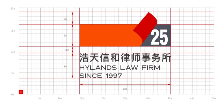
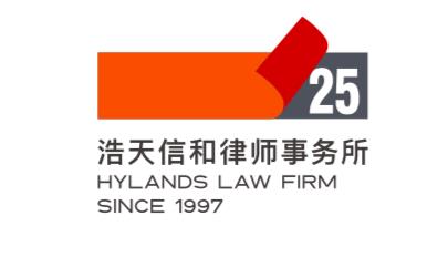
Both the Chinese name of the law firm 浩天信和律师事务所 and the English name HYLANDS LAW FRIM use sans-serif fonts, giving people a sense of calmness and simplicity, representing the firm's rigorous work attitude and innovative spirit.
The logo also includes the writing - ‘since 1997’ which symbolizes the cultural heritage of Hylands.
Passing the torch
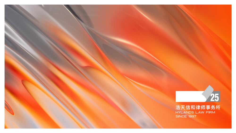
The logo uses orange, red, and gray as the main colors, which is the brand tone of the firm, implying the inheritance and innovation that Hylands insist upon.
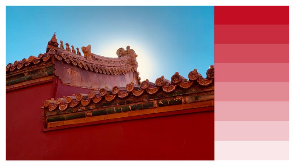
Red is an infectious color, like a flame, like a torch, implying Hylands’ great faith in a bright future.
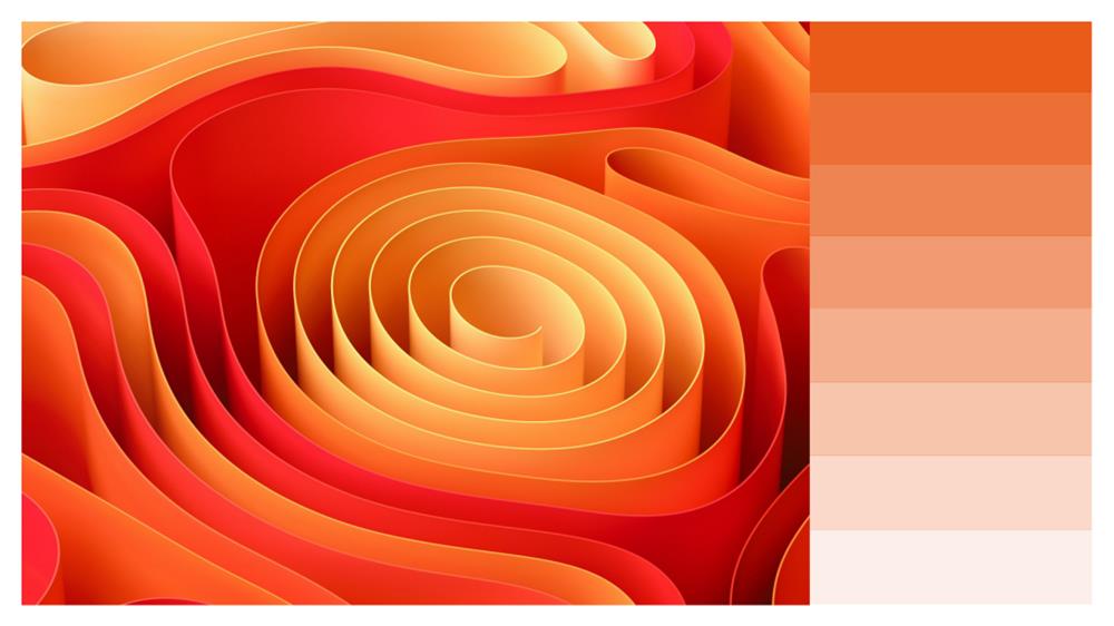
Orange is a cheerful, lively, and enthusiastic color and it is also the color of the sun. It reminds people of the innovative spirit of the Hylands. Sun represents the optimistic goal that the Hylands people are constantly pursuing and expresses Hylands’ ambition to reach new heights.
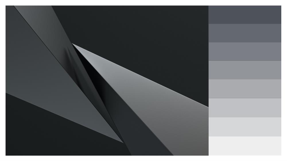
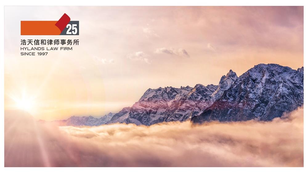
Gray is the major theme color of Hylands and the main color of the original logo. It represents inheritance and reflects the values of altruism and sharing which aligns well with the Hylands’ dictum of ‘no brothers, no partnership’. At the same time, gray gives people a sense of calmness which represents Hyland's determination to ‘build a professional legal service platform with characteristics, system, influence, and inheritance’.
The release of the new logo is conducive to optimizing the image of the law firm, improving market awareness of the firm, and better conveying the brand's values. The release of the new logo marks that Hylands has started a new journey with a new attitude. Looking back at the past, we can't help but be full of expectations about the future. We will be brave to forge ahead and continue to climb new heights.